Most SaaS products do not lose users because the product is bad. They lose users because the first ten minutes inside the product are confusing, and nobody on the team can see exactly where that confusion starts. Onboarding analytics exists to answer one question: where, specifically, does a new signup stop moving forward? Get that answer right and you fix the single biggest lever on retention. Get it wrong and you keep guessing while trial users quietly disappear.
The hard part is that most teams only measure onboarding with a signup count and an activation rate. Those two numbers tell you that something is wrong. They never tell you what. To find the actual stuck point, you need to watch the funnel step by step and, ideally, watch a few real sessions of people walking through it.
Why Onboarding Is Where Most SaaS Products Lose Users
Trial-to-paid conversion for self-serve SaaS tends to sit well under 20%, and the drop happens fast. Most of it is gone within the first session. A new user signs up with intent, lands on an empty dashboard, is asked to connect an integration or invite a teammate before they have seen any value, and leaves. They rarely come back to finish the job.
This is different from a marketing problem. The visitor already said yes once, they created an account. What kills them next is friction inside the product itself: a setup step that needs information they do not have yet, a confirmation email that lands in spam, a form that resets when they hit back. None of that shows up in a top-of-funnel report. It only shows up if you are watching the onboarding flow specifically.
The Three Onboarding Drop-Off Patterns to Watch For
After looking at enough onboarding funnels, the drop-offs tend to repeat in three shapes:
- The setup wall. The user hits a required step, usually a connection, an API key, or a payment detail, before they have seen anything that proves the product is worth that effort.
- The empty state. The user finishes setup and lands on a dashboard with no data, no sample content, and no clear next action. They do not know what to click, so they click nothing.
- The silent error. Something technically fails, a form validation message that is easy to miss, a slow API call that times out, and the user assumes the product is broken rather than realizing it is their own input.
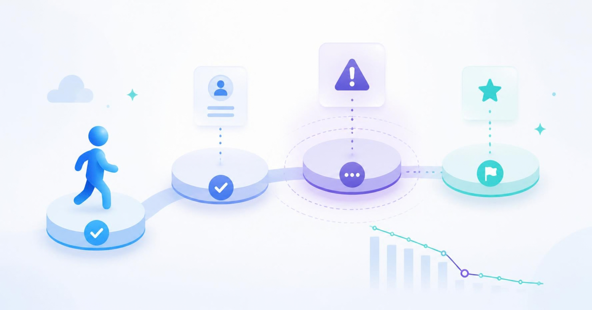
You cannot tell these three apart from conversion numbers alone. A 40% drop at step three could be any of them, and each one needs a completely different fix.
Build an Onboarding Funnel That Shows You the Truth
Start by mapping the real steps a new user has to take before they reach their first meaningful result, not the steps your product team assumes they take. Signup, email confirmation, first setup action, first integration, first piece of real data in the dashboard. Each one becomes a funnel stage.
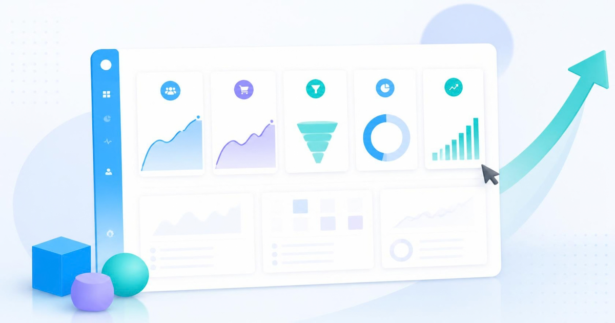
A funnel report built this way will usually surface one stage with a much bigger drop than the rest. That stage is where you look next, not at the whole flow. LeadFnF's funnel tool is built for exactly this, lay out the onboarding steps once and watch where the real-time drop-off concentrates, instead of waiting for a weekly report to tell you something already happened.
The conversion rate tells you something is wrong. The session replay tells you what it actually is.
Watch Sessions, Not Just Numbers
Once you know which onboarding step is bleeding users, pull up a handful of session replays from people who dropped at exactly that point. This is usually where the real cause shows up in under two minutes of watching. You will see the rage click on a button that looks interactive but is not, the scroll past a field that was easy to miss, or the long pause before someone gives up on a form.
Heatmaps help here too, particularly on the first dashboard screen after setup. If attention is clustering on an element that does nothing, or avoiding the one button that actually moves the user forward, that is your empty-state problem made visible. This is the part of onboarding analytics that pure numbers cannot give you, and it is usually a fifteen-minute exercise once you have the right sessions queued up.
The Metrics That Actually Matter in the First Seven Days
Skip vanity numbers like total signups and look at these instead:
- Time to first value: how long between signup and the first moment the product does something useful for that specific user.
- Step-by-step completion rate through your real onboarding funnel, not a generic activation percentage.
- Day 1 and Day 7 return rate, which tells you whether the first session actually created a reason to come back.
- Drop-off concentration, meaning which single step accounts for the largest share of lost users.
Four numbers, tracked weekly, will tell you more about onboarding health than a dashboard full of twenty metrics nobody checks.
A Weekly Onboarding Review One Person Can Run
This does not need a dedicated growth team. Once a week, pull the onboarding funnel, note which step has the worst drop, watch three to five session replays from users who dropped there, and write down the one most common reason. Ship a small fix. Repeat next week against the new worst step.
Most of LeadFnF's customers run this as a fifteen-minute Monday habit rather than a formal process. It works because it is small enough to actually happen every week, and it is grounded in what real users did rather than what the team assumed they would do. The script behind it is a single three kilobyte snippet with no cookie banner required, since it is privacy-first by default, so there is no setup tax before you start getting answers.
Onboarding is the one part of the product where every session matters, because you only get one first impression per user. Watching it closely, with real funnels and real replays instead of a single activation percentage, is the fastest way to find out why good users are leaving before they ever became customers. If you want to see your own onboarding funnel this way, you can start a free trial of LeadFnF and have it mapped out in minutes.