A heatmap looks complicated the first time you open one. Blobs of red and blue sitting on top of your webpage, colour gradients bleeding into each other, no obvious scale or legend. It's easy to stare at it, nod slowly, and close the tab having learned nothing.
This guide fixes that. By the end you will know exactly what each colour means, what the four heatmap types show you, the five patterns that matter for conversion, and a 10-minute workflow you can run today — no design experience required.
Key Takeaways
- Red = hot (high activity), blue = cold (low activity). The colour scale is the same across all heatmap types: red areas got the most clicks, scroll depth, or cursor attention; blue areas got the least (Mouseflow, December 2025).
- There are four main types: click heatmaps, scroll heatmaps, move/hover heatmaps, and rage click heatmaps — each answers a different question about user behaviour (Inspectlet, April 2026).
- Fewer than 50% of users scroll below the fold on most pages — meaning content you placed halfway down may be invisible to half your audience (heatmap.com, 2025).
- When a SaaS company moved their CTA above the fold based on scroll heatmap data, trial sign-ups increased by 35% (FasterCapital, 2025).
- Moving a CTA from the bottom to the top of a page turned a 2.1% conversion rate into 4.7% — a real-world A/B test confirmed by heatmap analysis (Guideflow, April 2026).
- Always analyse mobile and desktop heatmaps separately — layout, scroll depth, and click patterns differ significantly between devices.
What Is a Heatmap? (The 30-Second Version)
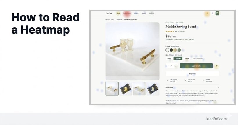
A heatmap is a colour-coded overlay on top of your actual webpage that shows where users interact. Instead of giving you rows of numbers, it shows you patterns visually.
The colour logic is borrowed from thermal imaging:
- Red and orange — high activity. Lots of users clicked here, scrolled this far, or moved their cursor across this area.
- Yellow and green — moderate activity.
- Blue and purple — low activity. Few users reached or interacted with this area.
- Grey or no colour — almost no activity at all.
The warmer the colour, the more attention or interaction that area received. The cooler the colour, the more it was ignored.
That's the entire colour system. Everything else is about knowing which type of heatmap you're looking at — because each type measures something completely different.
The 4 Types of Heatmaps (And What Each One Tells You)
Type 1: Click Heatmap
What it measures: Where users click or tap on your page.
What you see: Red blobs sitting on top of your most-clicked elements — navigation links, buttons, images, headings. Blue or empty areas where nothing was clicked.
The key question it answers: Are users clicking on the right things — and ignoring the wrong things?
What to look for:
- Red on your CTA button — users are finding and clicking your main action. Good.
- Red on a non-clickable image or heading — users expect it to be interactive but it isn't. False affordance. Fix it or make it clickable.
- Blue on your CTA button — nobody is clicking your most important element. Either it's not visible, not compelling, or positioned below where users stop scrolling.
- Clicks scattered randomly across the page — users are confused about what to do next. Navigation or hierarchy problem.
Click heatmaps on your header navigation reveal which categories users browse most, which they ignore, and whether the menu structure matches how users actually think. — Inspectlet, April 2026
Real example: If your click heatmap shows heavy clicking on your pricing link in the nav — far more than on your "Start free trial" CTA — users are price-shopping before they're ready to commit. Consider adding price context earlier on the page to pre-answer the question before they have to go look for it.
Type 2: Scroll Heatmap
What it measures: How far down the page users scroll before leaving.
What you see: The top of the page is always red (everyone sees it). Colour fades to orange, yellow, then blue as you go further down — showing progressively fewer users reaching each section.
The key question it answers: Is my important content actually being seen?
What to look for:
- Sharp colour drop at a specific point — a "scroll cliff." Users are stopping abruptly. Something at that point is causing them to decide they've seen enough. Could be a visual break, a section that feels like a footer, or content that appears complete.
- Gradual fade — normal. Users are dropping off steadily as they scroll, which is expected behaviour.
- Your CTA is in a blue zone — fewer than the percentage of users who would need to see it are actually reaching it. Move it higher.
- Less than 50% reach below the fold — this is typical. Don't panic, but do make sure your most critical information (value proposition, primary CTA) lives in the top 50% of your page.
The top of the page is red hot because everyone who visits will — at minimum — see above the fold. Don't panic if fewer than 50% of users navigate below the fold. That's actually normal. But it means there's room for improvement. — heatmap.com, 2025
Real example: A SaaS company's scroll heatmap showed only 28% of visitors reached the feature benefits section buried two-thirds down their pricing page. They moved the most compelling content above the fold and simplified the structure. Form submissions grew by 36% (Skymoon, November 2025).
Type 3: Move (Hover) Heatmap
What it measures: Where users move their cursor on desktop — without necessarily clicking.
What you see: Trails and clusters of cursor activity across the page. Hot spots where cursors hovered or paused. Cool areas the cursor never visited.
The key question it answers: What is drawing users' visual attention — even if they don't click?
Important caveat: Move heatmaps are desktop-only — they don't exist on mobile (no cursor). And cursor movement is a proxy for attention, not a direct measure. Users often move their cursor towards things they're reading, but not always.
What to look for:
- Cursor clustering around an element without clicks — users are reading or considering it, but not acting. If it's a CTA, the copy may not be compelling enough to convert interest into action.
- Cursor trails following text — users are reading that section carefully. It matters to them. Make sure what follows it is actionable.
- Cursor avoiding large sections entirely — that section is being skipped visually. Consider removing it or replacing it with something more compelling.
- Cursor clustering near the top navigation — users are uncertain about where to go next. Navigation clarity or hierarchy may be the issue.
Type 4: Rage Click Heatmap
What it measures: Where users click the same spot multiple times in rapid frustration — typically 3+ clicks within 2 seconds on the same element.
What you see: Concentrated red spots, often on elements that look interactive but aren't working — or aren't working fast enough.
The key question it answers: Where is my page actively frustrating users?
What to look for:
- Rage click cluster on a button — the button isn't responding (JavaScript error, slow load, disabled state with no visual feedback).
- Rage click cluster on a non-clickable element — users expect it to be interactive. A false affordance that needs to be fixed or made real.
- Rage click cluster on mobile near a small element — touch target too small for reliable tapping. Needs to be larger (minimum 48×48px per Google's mobile UX guidelines).
For a deep dive into rage clicks specifically, see What Is a Rage Click? (And 5 Ways to Eliminate Them).
Always Do This: Separate Desktop and Mobile
Before you read a single heatmap, check which device segment you're looking at.
Desktop and mobile users behave completely differently on the same page:
- Scroll depth: Mobile users typically scroll further because content stacks vertically, but they also drop off faster if the first screen doesn't hook them.
- Click targets: What's easy to click on desktop (a 20px text link) is nearly impossible to tap accurately on mobile. Click heatmaps on mobile reveal touch target failures that desktop heatmaps hide entirely.
- Above the fold: The "fold" is in a completely different place on a 375px mobile screen vs a 1440px desktop monitor. Your CTA may be above the fold on desktop and three scrolls down on mobile.
Treat mobile and desktop as separate experiences, because layout and attention patterns differ significantly. On mobile, small screens and longer scroll lengths often mean key elements get less visibility. — Contentsquare, 2026
In LeadFnF, click heatmaps are automatically separated by device type — desktop (≥1024px), tablet (768–1023px), and mobile (<768px) — so patterns from one device don't blur into another. Always read each device segment independently before drawing conclusions.
The 10-Minute Heatmap Reading Workflow
You don't need to spend an hour on every heatmap. Here's a focused 10-minute process that extracts the most useful insights from any page.
Minutes 1–2: Orient yourself
Before reading any data, answer these questions about the page:
- What is the one thing I want users to do on this page? (Sign up, click a CTA, read a section, buy?)
- Where is that element positioned on the page?
- What device am I looking at?
Write the answers down. You need a goal before patterns become meaningful.
Minutes 3–4: Open the scroll heatmap first
The scroll heatmap gives you the most important insight quickest: are users reaching your goal element at all?
Find your CTA or primary action element on the page. Note what percentage of users scroll to that point. If fewer than 60% reach it, that's your first priority to fix — move it higher or add a secondary CTA above the fold.
Note where the sharpest colour drop occurs. That scroll cliff is worth investigating.
Minutes 5–6: Open the click heatmap
Now that you know what percentage of users reach your CTA, find out what they're clicking instead.
Look for:
- Red on non-clickable elements — false affordances
- Blue on your primary CTA — missed or ignored
- Unexpected clicks on elements you didn't design as entry points
Minutes 7–8: Open the rage click heatmap
Scan for any concentrated red spots on interactive elements. Each one is a broken or frustrating experience worth investigating. If you find one, open session recordings filtered by rage click events to watch what happened.
Minutes 9–10: Write one insight and one action
Before closing the heatmap, write:
"I noticed [specific pattern] on [specific element]. My hypothesis is [cause]. My next action is [specific change]."
One concrete action is worth more than twenty observations. Heatmaps are diagnostic tools — they're only valuable if they lead to a change you can test.
5 Patterns That Matter Most
After reading hundreds of heatmaps, these five patterns show up repeatedly and almost always indicate something worth fixing.
Pattern 1: The Blue CTA
Your primary CTA button shows little to no click activity. Before assuming the copy is bad, check your scroll heatmap: is the CTA even in a zone that users reach? Most "blue CTA" problems are positioning problems, not copy problems.
Fix first: Move the CTA above the fold. Then re-read the heatmap.
Pattern 2: The Scroll Cliff
A sudden sharp drop in scroll depth at a specific point — often 40–60% down the page. Users are deciding the page is done before it actually is.
Common causes: a visual element that looks like a footer (dark background, horizontal rule), content that wraps up a topic too conclusively, or a section break that signals "end of page."
Fix first: Remove visual elements that look terminal. Add a transitional sentence or heading that pulls users forward.
Pattern 3: The Phantom Click
High click volume on a non-interactive element — an image, a card, a heading, a logo. Users expect it to do something.
Fix: Either make it interactive (link the image, make the card clickable) or redesign it so it no longer looks interactive.
Pattern 4: The Navigation Escape
Click heatmaps show heavy activity in your header navigation but little on your page-level CTAs. Users are searching for something they can't find on the current page.
Fix: Either the page doesn't answer the user's question (content problem), or the CTA doesn't match their intent at this stage of their journey (offer timing problem). Review what traffic is landing on this page and whether the page matches what they were looking for.
Pattern 5: The Mobile Dead Zone
Your desktop heatmap looks great. Your mobile heatmap shows almost no click activity on the same CTA. The CTA is either off-screen, too small to tap reliably, or buried below a section that mobile users abandon.
Fix: Open your site on an actual phone and navigate to the page. What you see is what your mobile users see. The fix is usually repositioning, making the touch target larger, or simplifying the mobile layout so the CTA appears earlier.
Common Mistakes When Reading Heatmaps
Mistake 1: Reading desktop and mobile together
Mixing device data produces heatmaps that reflect no real user's actual experience. Always filter by device before drawing any conclusions.
Mistake 2: Looking for red without a goal
Opening a heatmap without a specific question produces general observations that lead nowhere. Always know what you want users to do on this page before you open the heatmap.
Mistake 3: Acting on too little data
A heatmap with 50 clicks is statistical noise. Most patterns require at least 500–1,000 sessions before they're reliable enough to act on. If you have low traffic, wait before concluding anything from a heatmap — or prioritise your highest-traffic pages first.
Mistake 4: Treating heatmaps as answers, not questions
A heatmap shows you where something is happening. It rarely tells you why. Red on a non-clickable image tells you users expected it to be interactive — but you still need to watch session recordings to understand whether they were confused, frustrated, or simply curious. Heatmaps identify the area. Recordings explain the behaviour.
A heatmap is a diagnostic tool, not a magic button. It shows where something feels wrong. It does not automatically tell you what fix will improve conversions. Strong teams pair heatmaps with analytics, session replay, and testing. — Plerdy, March 2026
Mistake 5: Checking heatmaps once and forgetting them
Heatmaps are most valuable as a before-and-after tool. Read the heatmap before you make a change. Make the change. Read the heatmap again two weeks later. Did the pattern change? Did your CTA go from blue to red? That's the feedback loop that makes heatmaps useful over time.
Frequently Asked Questions
What does red mean on a heatmap?
Red indicates the highest level of activity — the most clicks, the highest scroll depth, or the most cursor movement, depending on the heatmap type. Blue indicates the lowest activity. The gradient from blue through yellow to red shows the spectrum of engagement across the page.
What is a good scroll depth?
It depends on the page type. For landing pages, seeing 60–80% of users reach the fold is solid. For long-form content pages, getting 50% of users to scroll halfway is reasonable. The benchmark to focus on is specific to your goal: what percentage of users reach your primary CTA? That number matters more than overall scroll depth.
How many sessions do I need before a heatmap is reliable?
Most practitioners recommend a minimum of 500–1,000 sessions per device segment before drawing conclusions from a click heatmap. Scroll heatmaps need slightly less data to show reliable patterns. If you have fewer sessions, focus on session recordings instead — individual sessions are more useful than aggregate patterns at low data volumes.
Can I use heatmaps on mobile?
Yes — click heatmaps and scroll heatmaps work on mobile. Move/hover heatmaps do not, because mobile has no cursor. Always analyse mobile heatmaps separately from desktop, as layout and behaviour patterns differ significantly.
Do I need to be a designer to act on heatmap data?
No. The most common heatmap-driven fixes — moving a CTA higher on the page, making a non-clickable image linkable, or simplifying a section where users drop off — are product or development decisions, not design decisions. Heatmaps give you the evidence. The fix is usually obvious once you can see the pattern.
What's the difference between a click heatmap and a move heatmap?
A click heatmap records actual clicks and taps — definitive user actions. A move heatmap records cursor position on desktop — which correlates with visual attention but is not the same thing as interaction. Use click heatmaps to diagnose CTA performance. Use move heatmaps to understand where users' attention drifts without committing to a click.
The Bottom Line
Reading a heatmap is not a design skill. It's a question-asking skill.
The colour tells you where. The heatmap type tells you what kind of behaviour. Your goal for the page tells you whether that behaviour is good or bad. And session recordings fill in the why when the heatmap alone isn't enough.
Start with one high-traffic page. Open the scroll heatmap and find your CTA. If fewer than 60% of users reach it, move it higher. Open the click heatmap and find what users are clicking instead of your CTA. Fix the false affordances and ignored buttons. Read the rage click heatmap and fix anything that's actively frustrating users.
That workflow takes 10 minutes and produces an actionable priority list. Run it every two weeks on your most important pages and you'll have a clearer picture of your users' behaviour than most teams three times your size.
LeadFnF generates click heatmaps automatically for every page on your site — separated by device, with no extra setup. Session recordings are there when you need to go deeper. Try it free for 14 days — no credit card required.